Millions of paper cuts: Why Are Web Forms Still So Frustrating?
Table of Contents
It’s 2025, and despite decades of progress in web development, filling out web forms still feels like an unnecessary struggle. The technology to make forms seamless has existed for years, yet poor implementation, outdated practices, and inconsistent standards keep frustrating users. If we want to improve user experience, we need to focus on three things: leveraging built-in browser capabilities, handling input flexibly, and designing forms based on real-world expectations.
1. Use Browser Features Effectively #
Modern browsers support features like inputmode and autocomplete that optimise the user experience, yet in many
cases they are not
implemented. Specifying inputmode="email" or inputmode="numeric" ensures users are presented with the right keyboard
on mobile
devices reducing friction in data entry. Despite broad support, these features are underutilised.
What a difference the right keyboard can make…
Email #
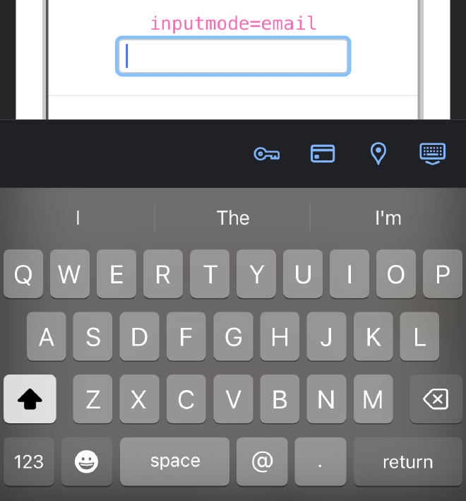
inputmode=email
Keyboard gains an @ and a . specific key.
Unlike the default keyboard the first letter entered is not automatically capitalised.
Telephone #
inputmode=tel
A numeric format keyboard and includes quick access to +*# Keys also display the 3 alpha characters each number represents.

URL #
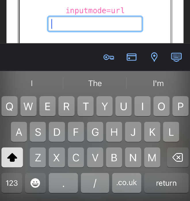
Includes keys with characters specific to entering urls including . and /
Also includes a button to complete the most used TLD, this is locale specific.
Numeric #
inputmode=numeric Limits entry to just numbers, great for ages etc

Decimal #
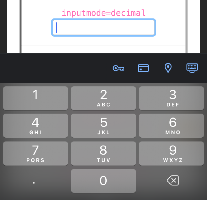
inputmode=Decimal
Very similar to numeric but also allows a decimal point to be entered
Search #
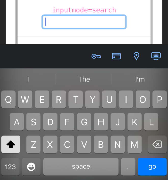
Displays a blue Go button instead of the return key on iOS and a green enter key on Android
Just a simple addition to a input field such as <input type="text" inputmode=“email”> and instantly less
friction for your users
2. Stop Punishing Users for Formatting Issues #
Many validation errors stem from formatting rather than actual mistakes. A classic example: phone numbers. Some forms reject an entry just because it includes spaces, dashes, or parentheses, even though that’s exactly how people write them.
Rather than forcing users to match a rigid format, forms should handle input intelligently:
- Strip spaces, dashes, and unnecessary characters before validation.
- Accept common variations and standardise them automatically.
- Display numbers in a familiar, readable format after submission.
This isn’t about using AI—it’s just common sense. Computers should do the work, not users.
3. Match Real-World Conventions #
Another recurring issue is inconsistency between what users see in the real world and what forms expect. Take credit card expiry dates: Every physical card displays them as MM/YY, yet some forms demand MM/YYYY or even spelled-out month names. Why introduce unnecessary friction? If there’s no strong reason to deviate from established conventions, forms should match user expectations.
And this applies beyond expiry dates. Check this example out I experienced just a few days ago.
A parking app requires the car registration (reg edited to not reveal plate, the characters have been kept exactly as formatted within the app).
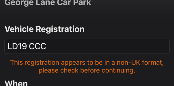
The plate is entered exactly as displayed on the vehicle with a space after the first 4 characters, and the app responds that this appears to be “in a non-UK format”.
The only way to enter the car registration is to remove the space, entering LD19CCC. Yes, this is very much a first world problem, and it is minor but why is it even a problem. Building data entry forms like this is not a new thing, just strip all white space from the string, then run the validation
Forms should be designed with real-world habits in mind:
- Use familiar date formats instead of forcing region-specific ones.
- Accept names with spaces, hyphens, and accents.
- Allow address entry in a way that aligns with local postal standards.
4. The Real Problem: Priorities, Not Technology #
It’s tempting to think bad forms exist because developers don’t care, but the reality is more complicated. Sometimes, legacy systems dictate field formats. Other times, security and compliance requirements force constraints. And often, usability just isn’t prioritised.
Improving web forms isn’t about discovering new technology—it’s about adopting best practices that already exist. Companies should audit their forms, question unnecessary constraints, and push for usability improvements. The goal isn’t perfection but removing unnecessary friction.
In 2025 this isn’t rocket science, it should just be table steaks.
A Call to Action #
Forms don’t have to be frustrating, using these approaches will fix significant ’low-hanging’ fruit, it won’t necessarily solve all form problems, you may well have very complex forms. But it will remove many obvious issues for your users. As developers, designers, and product managers, we should ask: Are we making this easier for users or adding unnecessary obstacles?
Small changes can have a big impact. Before another quarter of a century slips by, let’s make 2025 the year web forms no longer have easily solvable issues.